More Accessibility Testing
For my sixth post our assignment was to turn our analysis to our own User Science Journals, and make sure they pass all accessibility standards. I have pretty good habits of making sure alt tags are on images, plus this journal is using a bootstrap template under the hood, so I was curious to see how it would score with both the WAVE and Lighthouse diagnostic tools I wrote about in my previous post.
WAVE
Since Wave diagnostics gives a visual diagram when analyzing, I used it to evaluate this journal first. The three errors it encountered were ones I had not considered; the three social media links at the bottom of the page had not been filled in with live links and still only contained a place holder hash sign. Github and Linkedin are the only social networks I take an active part in, so I adjusted these two elements to display and link, and deleted Facebook and Twitter. Surprisingly, setting up these links was did not solve the errors so I ran this journal through Google's Lighthouse diagnostics to see if they would flag these icons as well, and they did.
Lighthouse
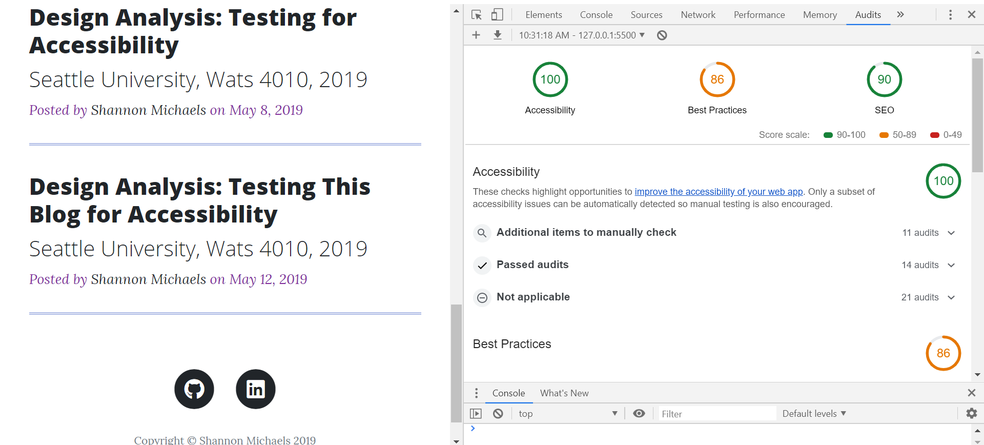
Google's provides helpful suggestions of how to fix these errors, and they recommended added an aria label to the social media icons so screen readers could announce them. After this was accomplished, my accessibility score improved but there was still one more item Google recommended tweaking: the color contrast of the "Posted by" heading of my journal listings on the main page. After I darkened these headers, my accessibility rating reached 100, see screen below.

After I reached my goal of attaining 100% accessability rating for this journal, I turned my attention to the best practices and SCO scores Google provides developers with, and I felt I could improve my website in both these areas. For SCO, Google recommended adding a meta tag to identify me as an author and a description of the content of the page. For best practices, Google recommended the addition of a rel="noopener' attribute on links that open in a new tab. This is a new recommendation to stop the hijacking of the document window by malicious hackers. Both of these changes improved my SCO and best practices scores dramatically.
Wrapping Up
After using these helpful diagnostic tools I did my own walk through, making sure all tabs functioned and content was laid out in a logical fashion. One change I made was to rework a default empty link box on the main page to provide a list of links that I can add to over time. I feel this has improved the overall visual appeal of the first page and it gives me an excuse to play with more css in the future. As a recap, the list below summarizes the changes I made to this User Science Journal to improve its accessibility, SCO, and best practices.
- Added Aria-label to all social media links.
- Improved text contrast in subheaders for the post list on the main page.
- Added links for the social media icons used, deleted all others.
- Added meta tag for author and content to improve SCO.
- Added rel='noopener' to all links opening in a new tab.
Stay tuned! In my next post I will dive into using Google Analytics for improved website performance. Until then, may your web user-experience be pleasant and accessible.
Resources:
Krug, Steve. Don't Make Me Think, Revisited : a Common Sense Approach to Web Usability. [Berkeley, Calif.] :New Riders, 2014.
Dobson, Rob. Google, Web fundamentals. How to do an accessability review, Link here
Google. Tools for Developers. Lighthouse. Web. 2019. Lighthouse link.
webaim.org. WAVE. Web. 2019. WAVE link